

The Kid Christmas Sketchbook Part 1
A peek inside the development of my newest book 'Kid Christmas: Of The Claus Brothers Toyshop'

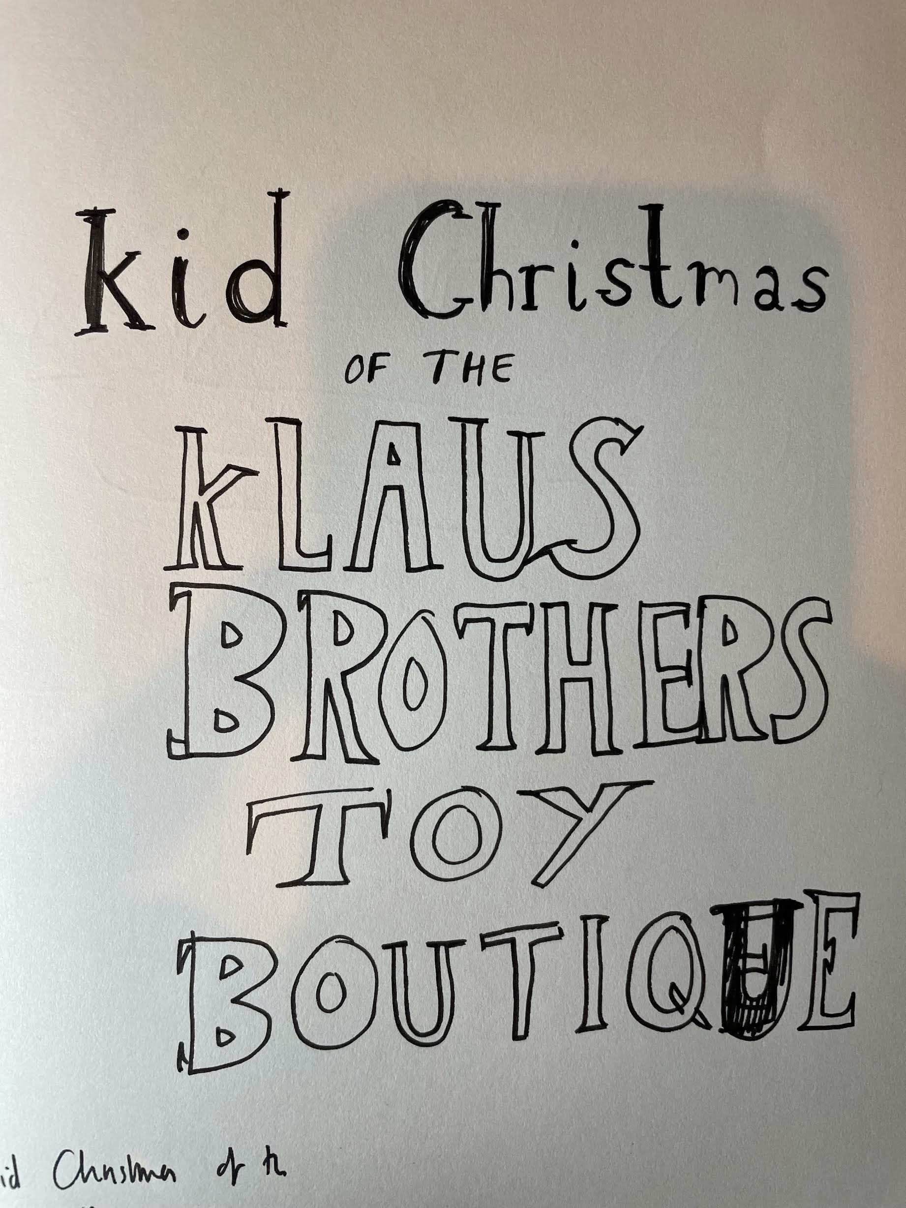
Hi all. Not too long until ‘The Big Day’. To celebrate I thought that I would give you all a peek into my sketchbook and maybe offer a little insight into how the idea for my latest book ‘Kid Christmas: Of The Claus Brothers Toyshop’ developed.
Scruffy Beginnings
From what I can remember the idea began with the title. I had one of those strange, day-dreaming type questions, what was Father Christmas called when he was younger? ‘Boy Christmas’? ‘Child Christmas?’ ‘Son Christmas?’
‘Kid Christmas’.
It just sounded perfect, it sounded like a Superhero’s name. I really liked it.
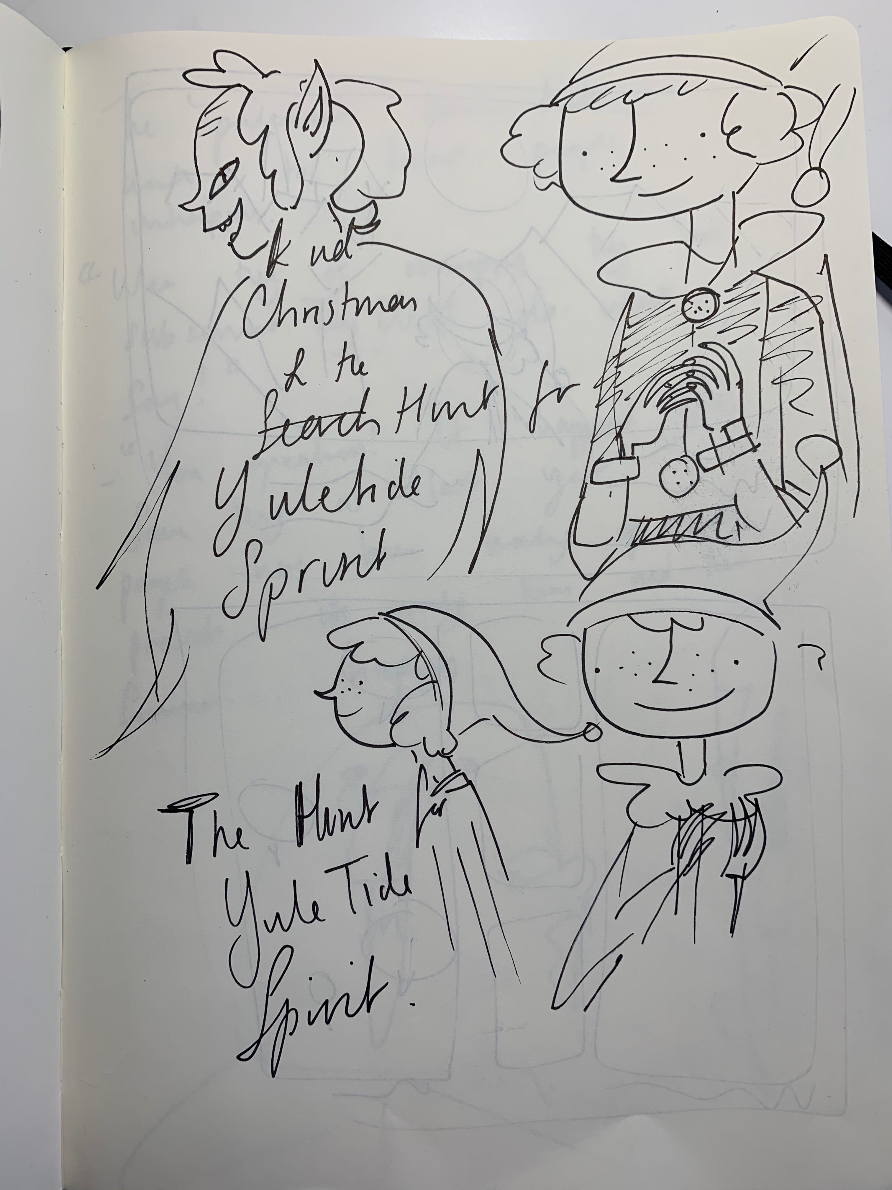
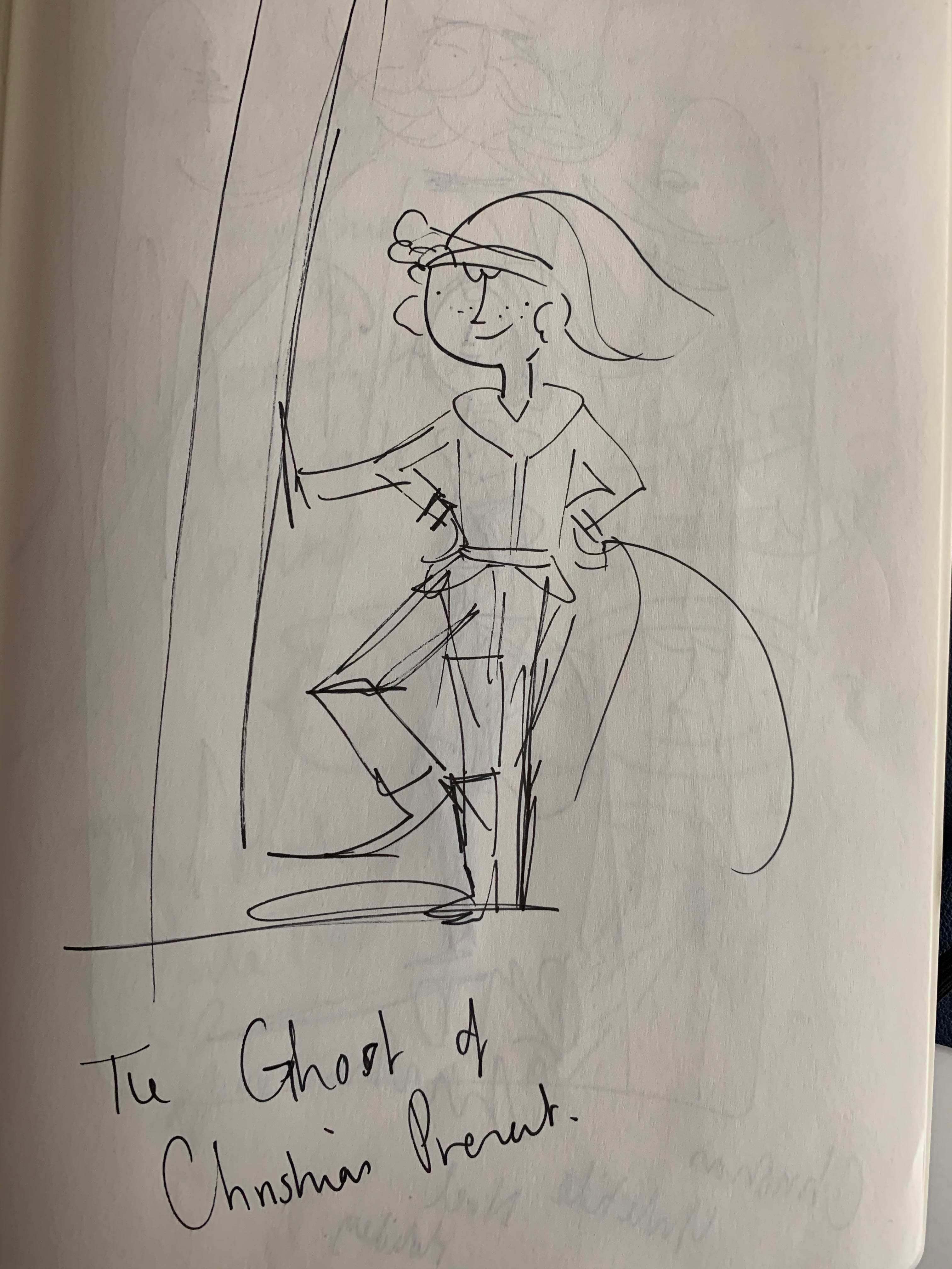
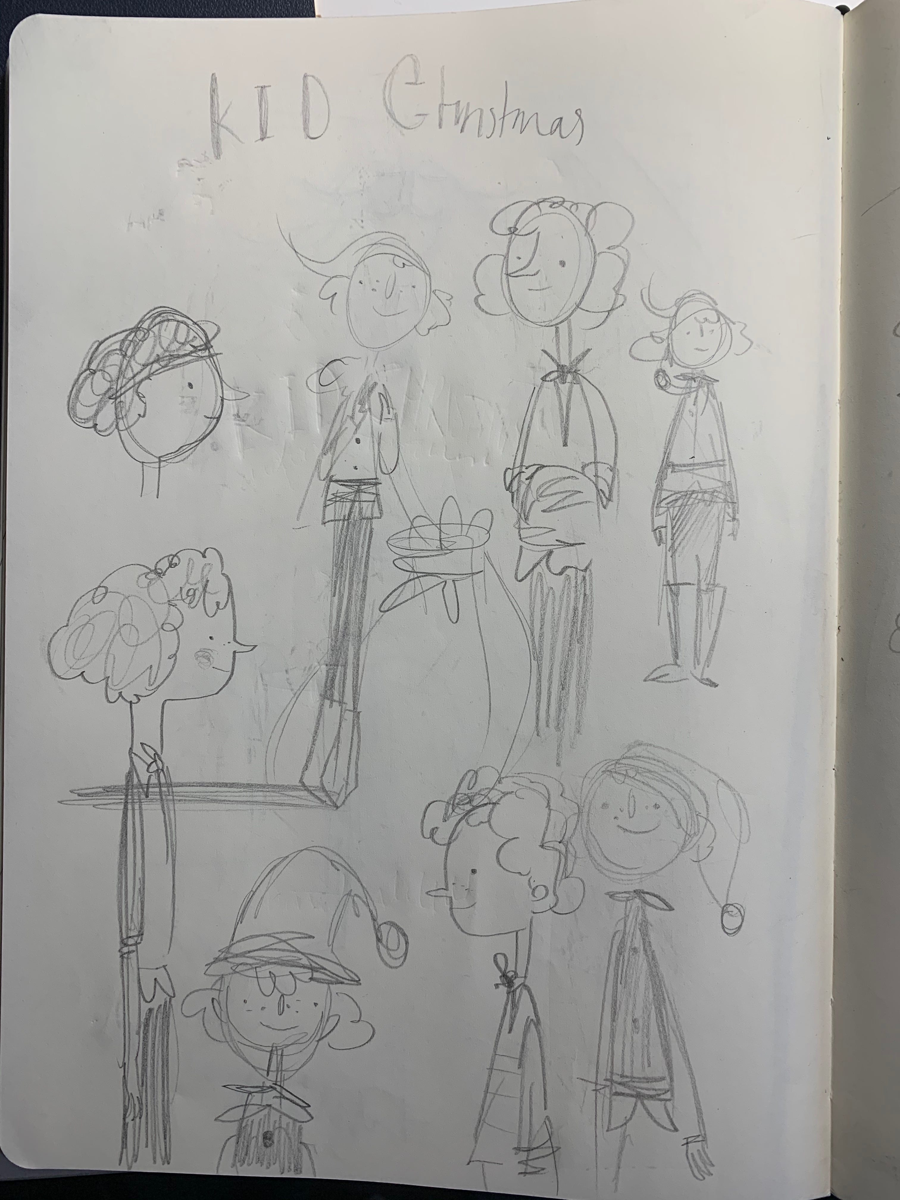
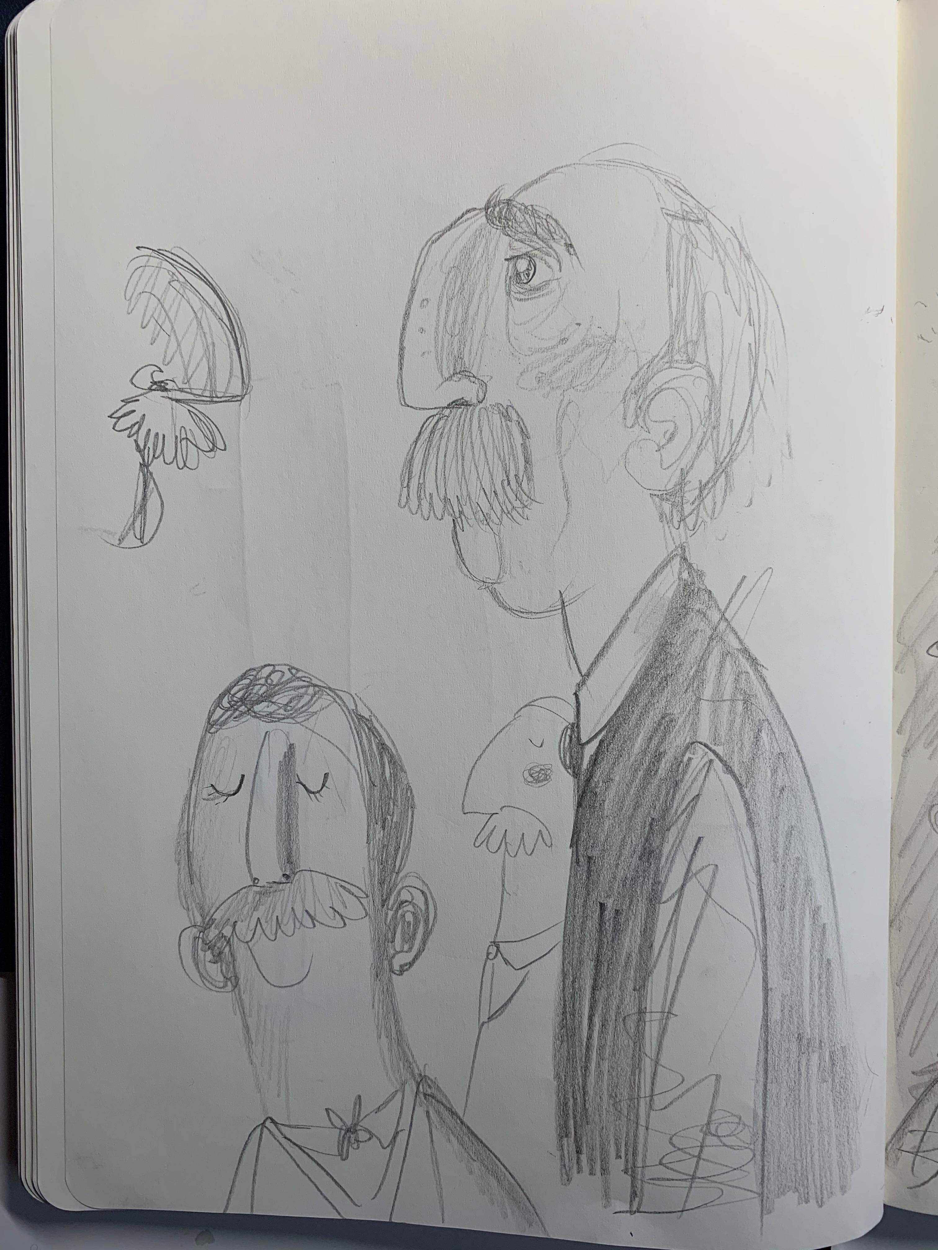
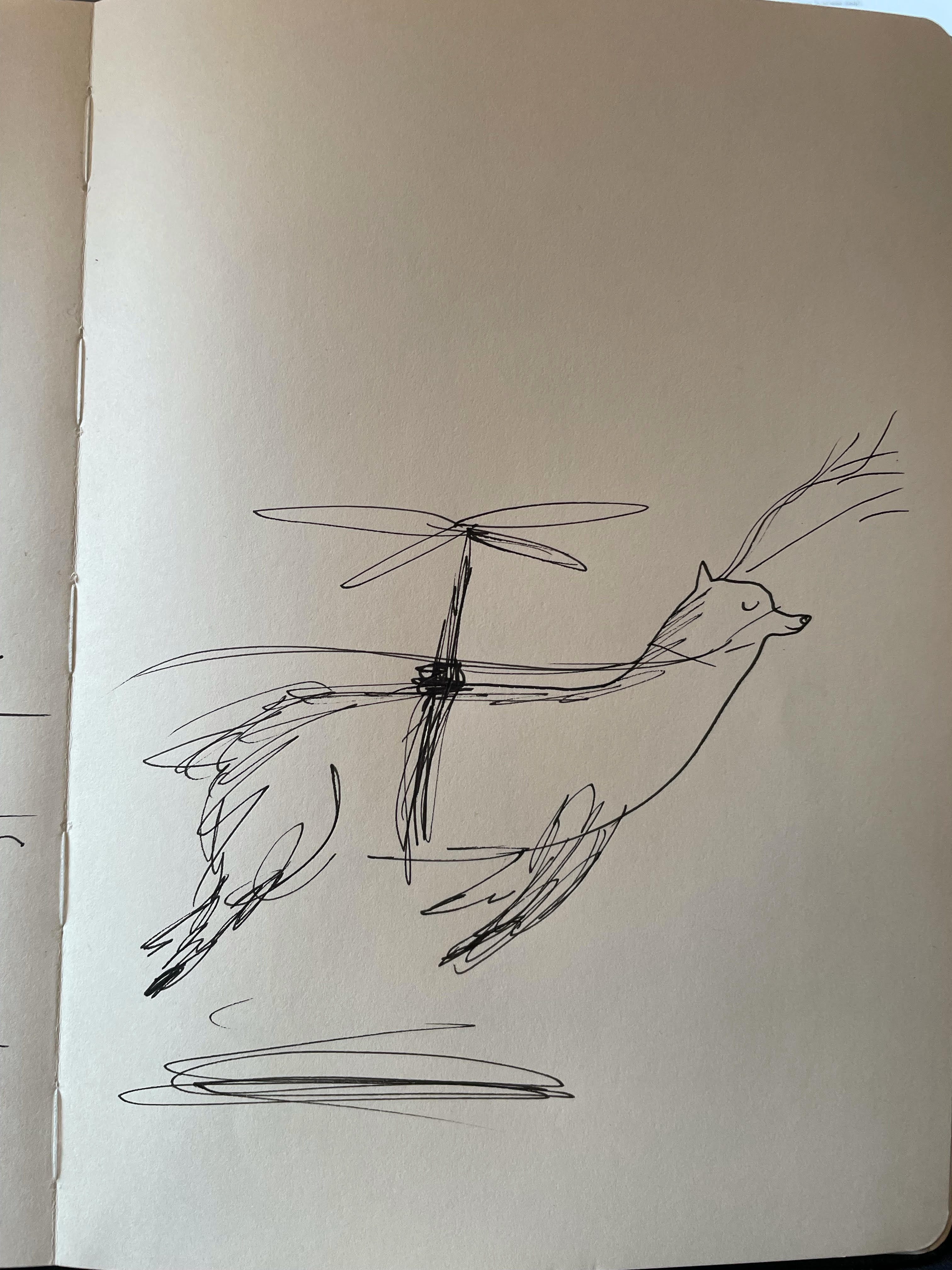
So, as usual when the first spark of an idea strikes I started doodling in my sketchbook. This is a very exciting point in a project where the possibilities are absolutely endless. The story can go anywhere. Its exciting, but these quick little sketches- which I always assume will never be seen by anyone but me (and here I am showing you all)- are always, incredibly, outrageously scruffy. But thats kind of the point I think, those first drawings are quick and urgent (and look like they were possibly drawn by my dog).
And here they are….
Concept Art
The idea sat brewing in my mind for a while. And even though it was nowhere near formed I decided to tell Katie-my editor at Frances Lincoln Children’s Books- all about it. She was also excited by this first little nugget of an idea and asked if I could mock up some artwork. This is the kind of thing that you have to do to get the powers that be at publishing companies on board with a project, especially as all I had at that moment was the aforementioned scruffy sketches.
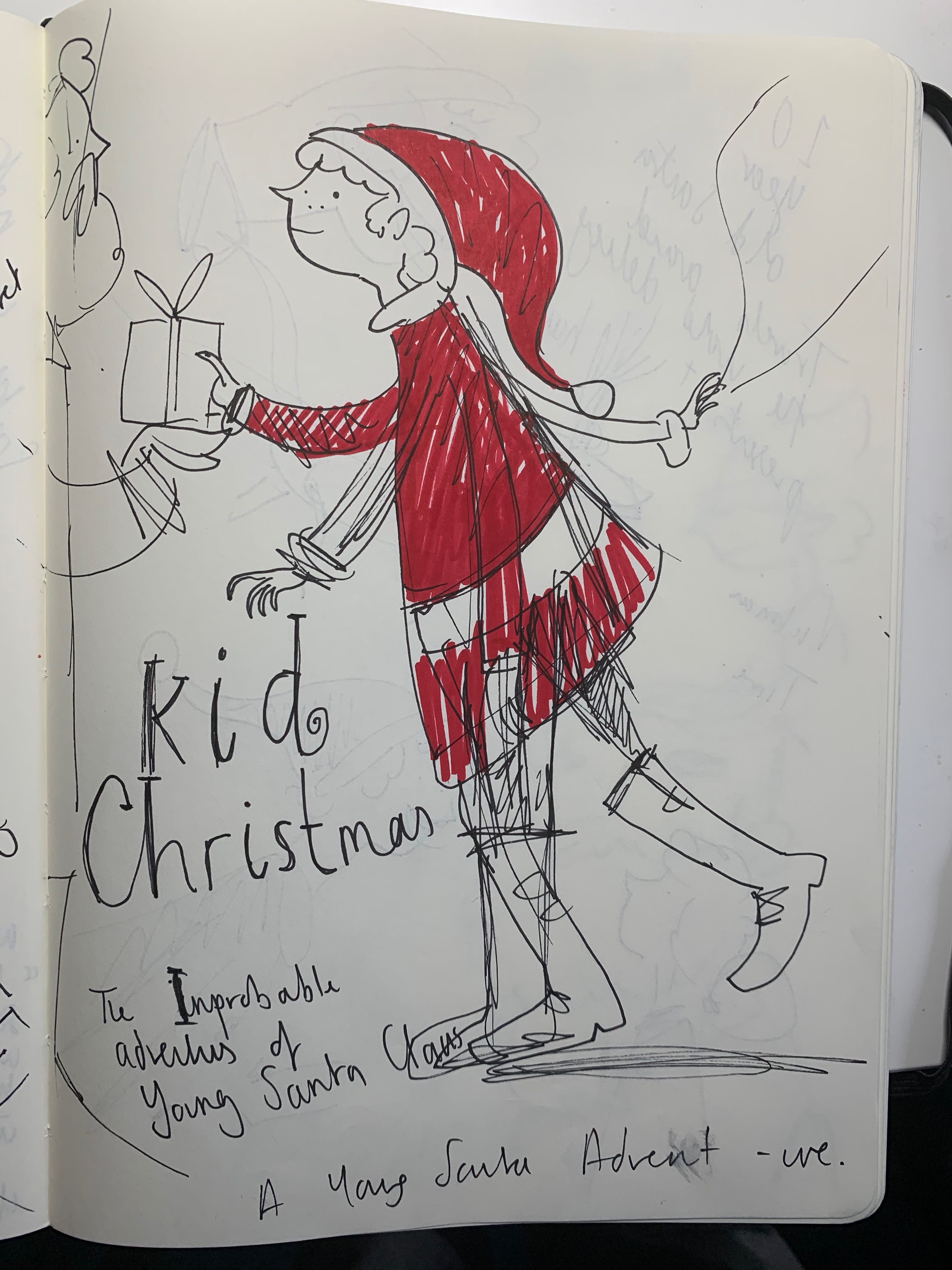
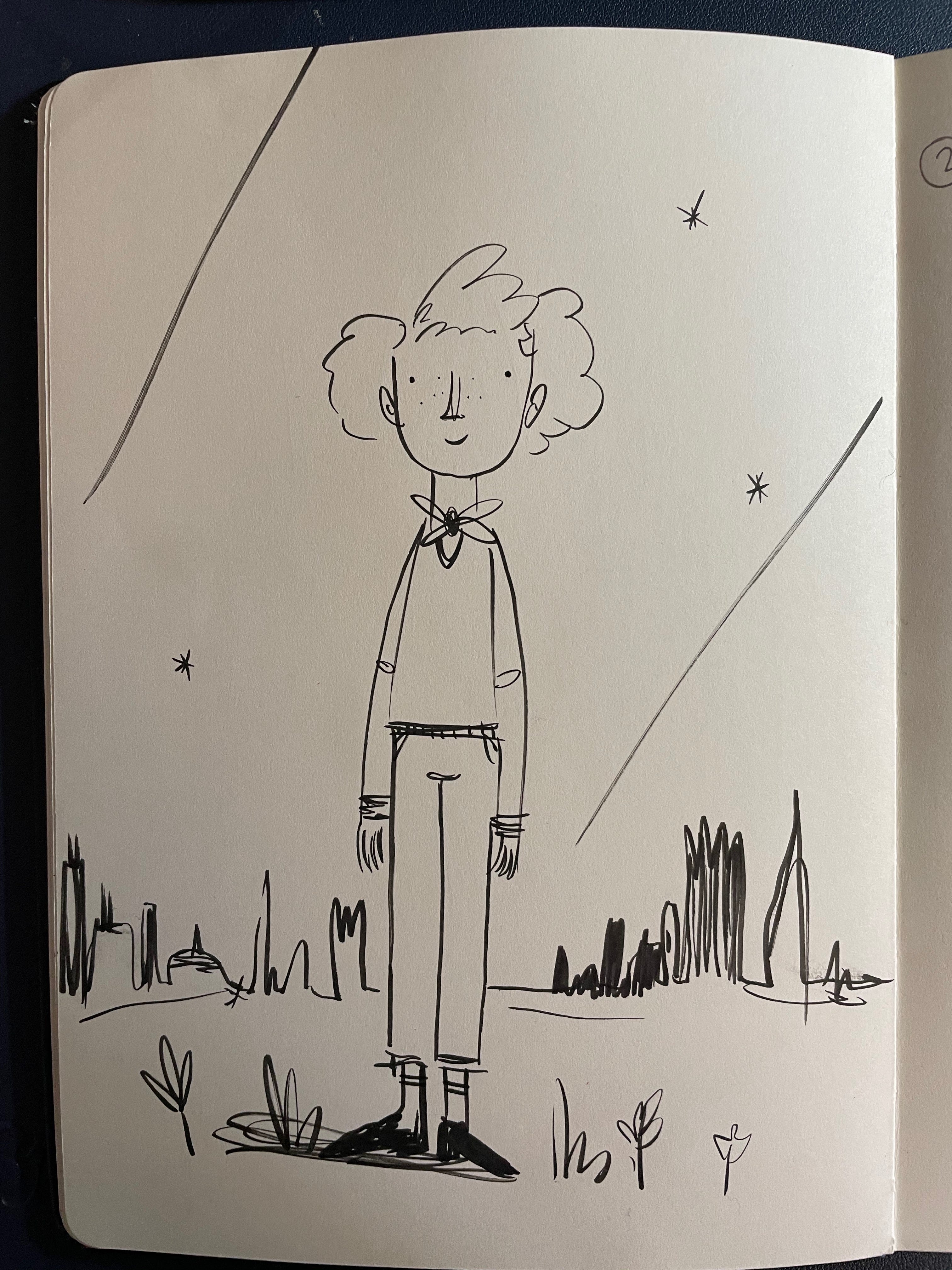
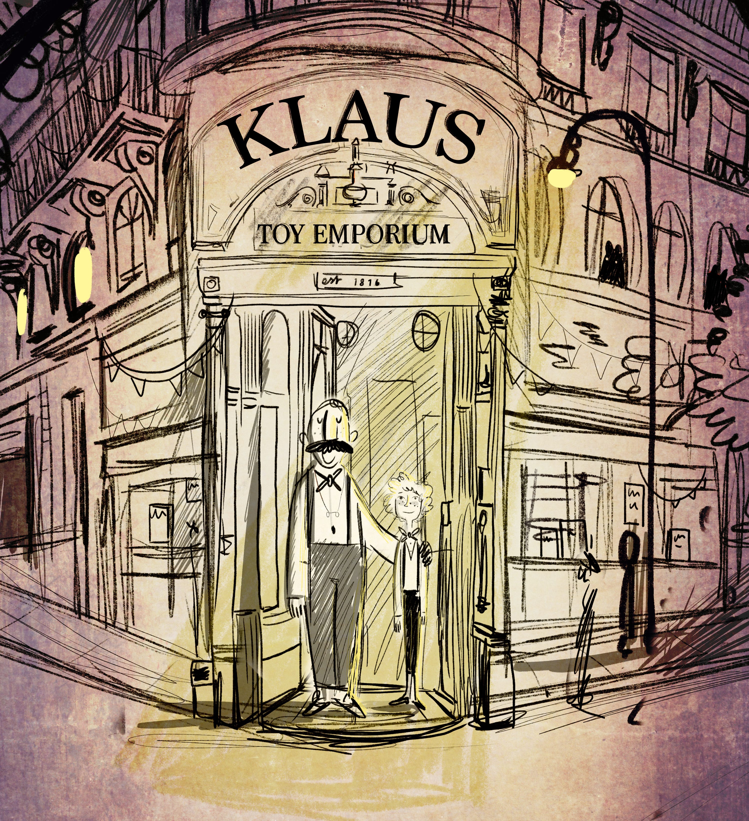
The image that I created was this one:
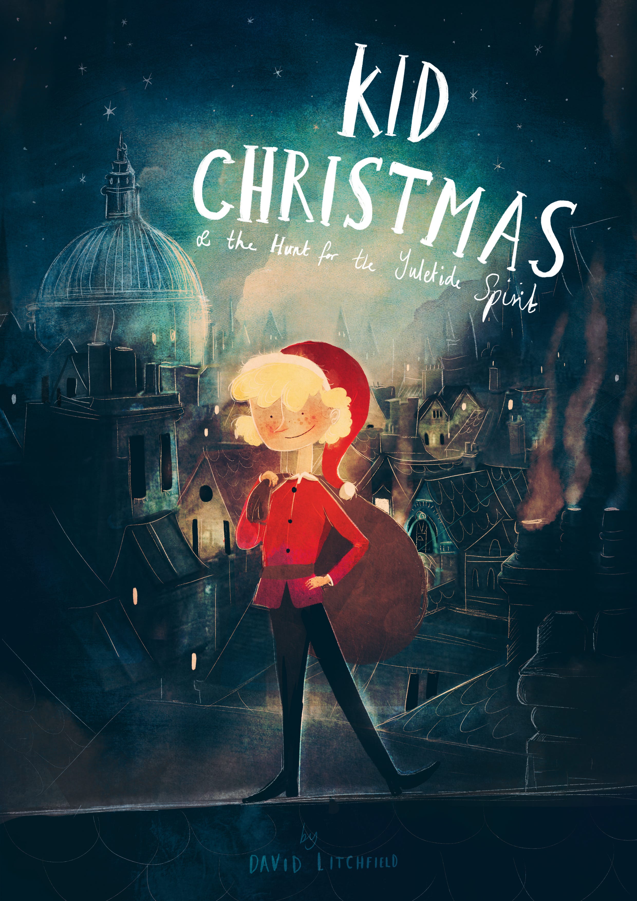
I really liked the idea of the story being set in a Victorian era. When I think of the perfect looking Christmas I see the snow capped rooftops of a Dickensian London. Like a lot of people ‘A Christmas Carol’ is one of my favourite books, and the image of Christmas that story presents was definitely the look I was hoping to capture. Also, the recognisable character of Santa that we all know and love- the big beard, big red coat, etc was first depicted in the mid 1800’s so it just felt like the right time period to set this story in. I wanted this first piece of concept art to very much capture that Victoriana feel, and I think that it does.
Thankfully, Katie and the other kind folk at Frances Lincoln Children’s Books agreed that it was an exciting idea and based on this first initial visualisation and a handful of possible story idea notes the the project was remarkably given the go ahead.
Which was amazing! And please note, it doesn’t usually happen this way. I would recommend having at least an outline of a narrative to go along with your concept art and sketches, before pitching your idea to a publisher.
But yes, the story.
Chiselling Out A Story.
I had a main character, a concept of sorts, a setting and a great deal of support from my incredible publisher. Now I just needed the most important thing. An actual story.
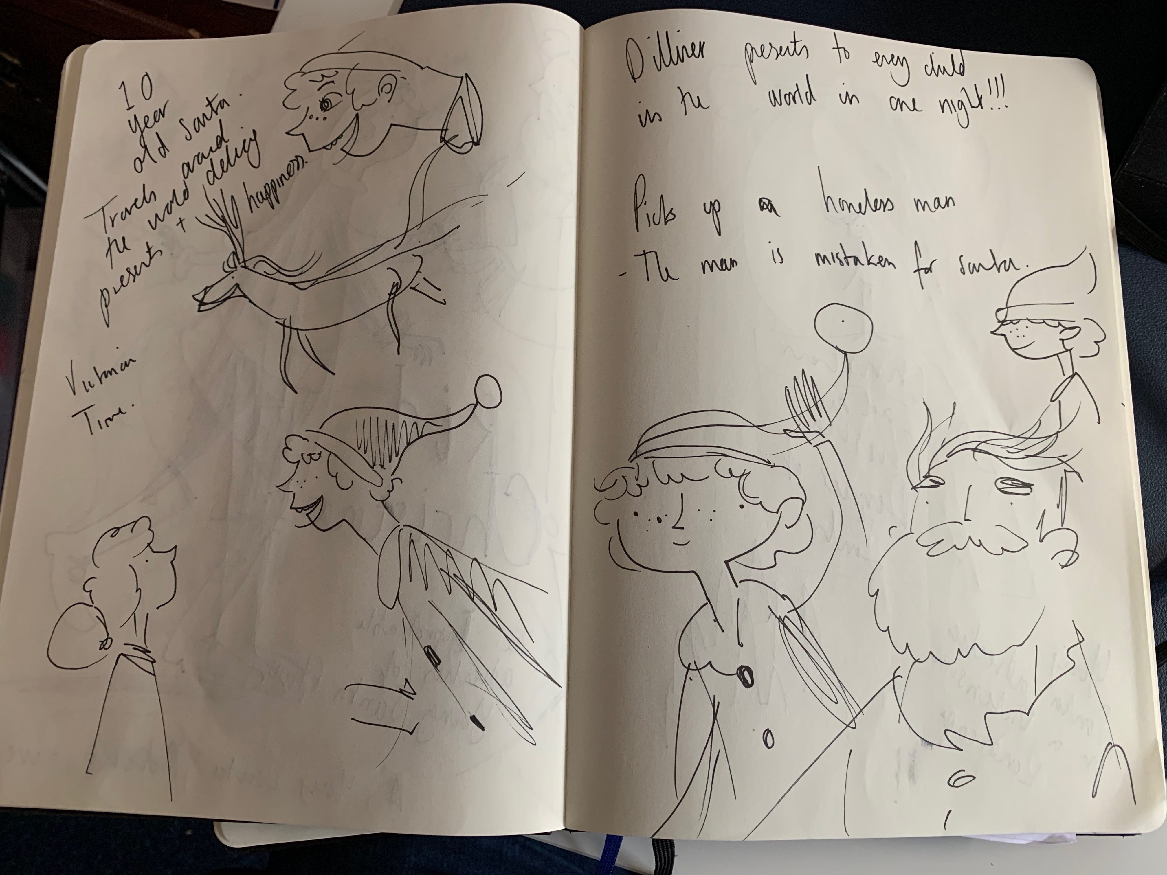
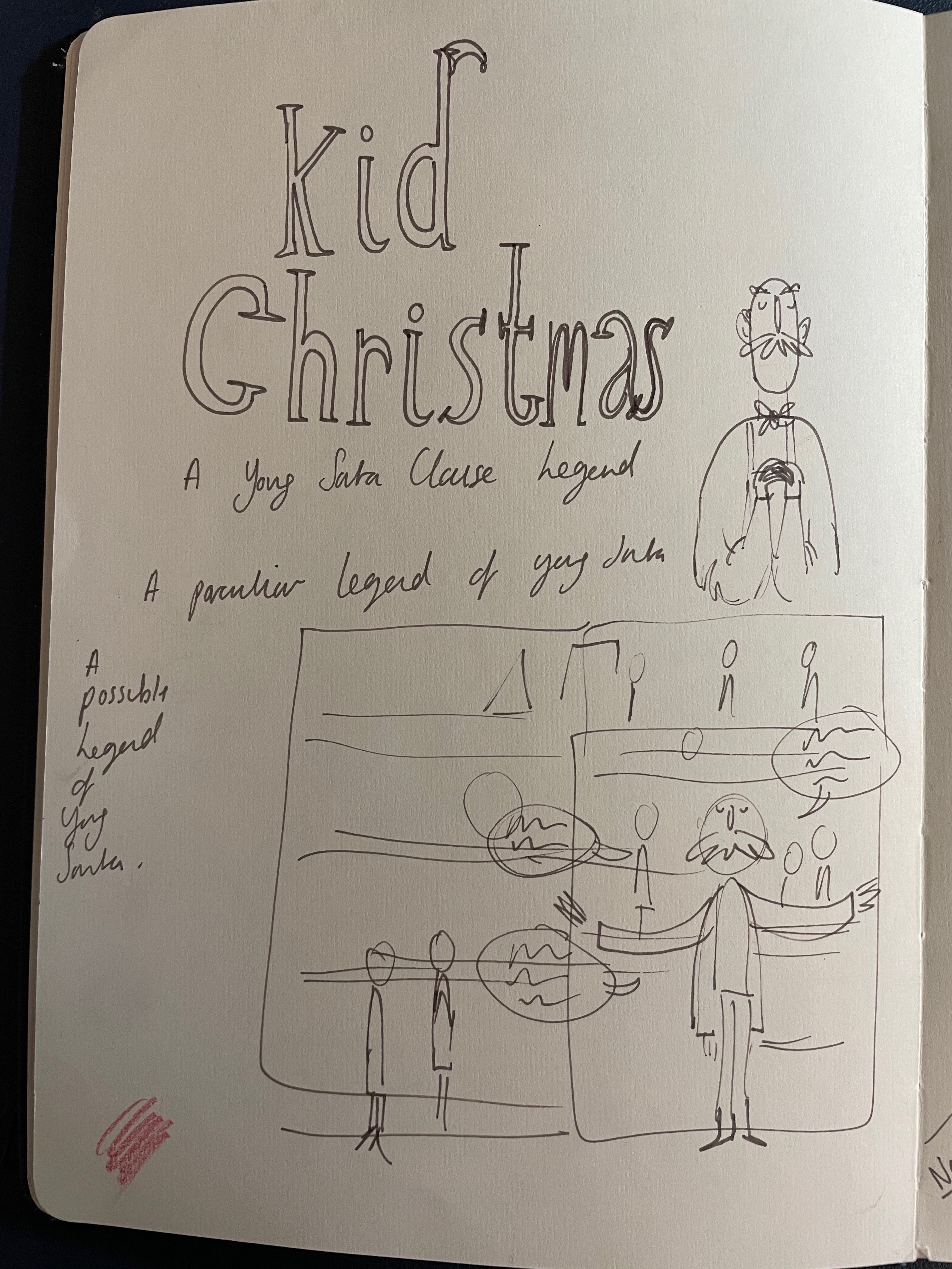
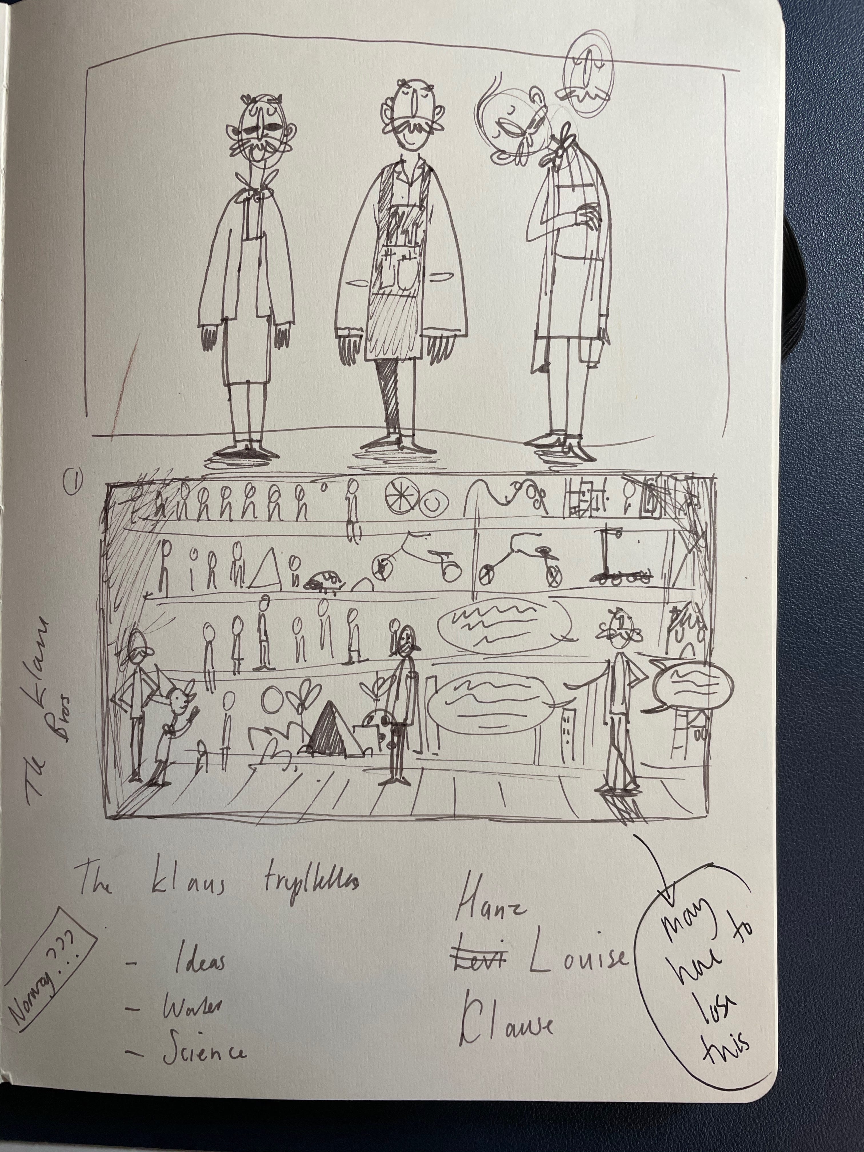
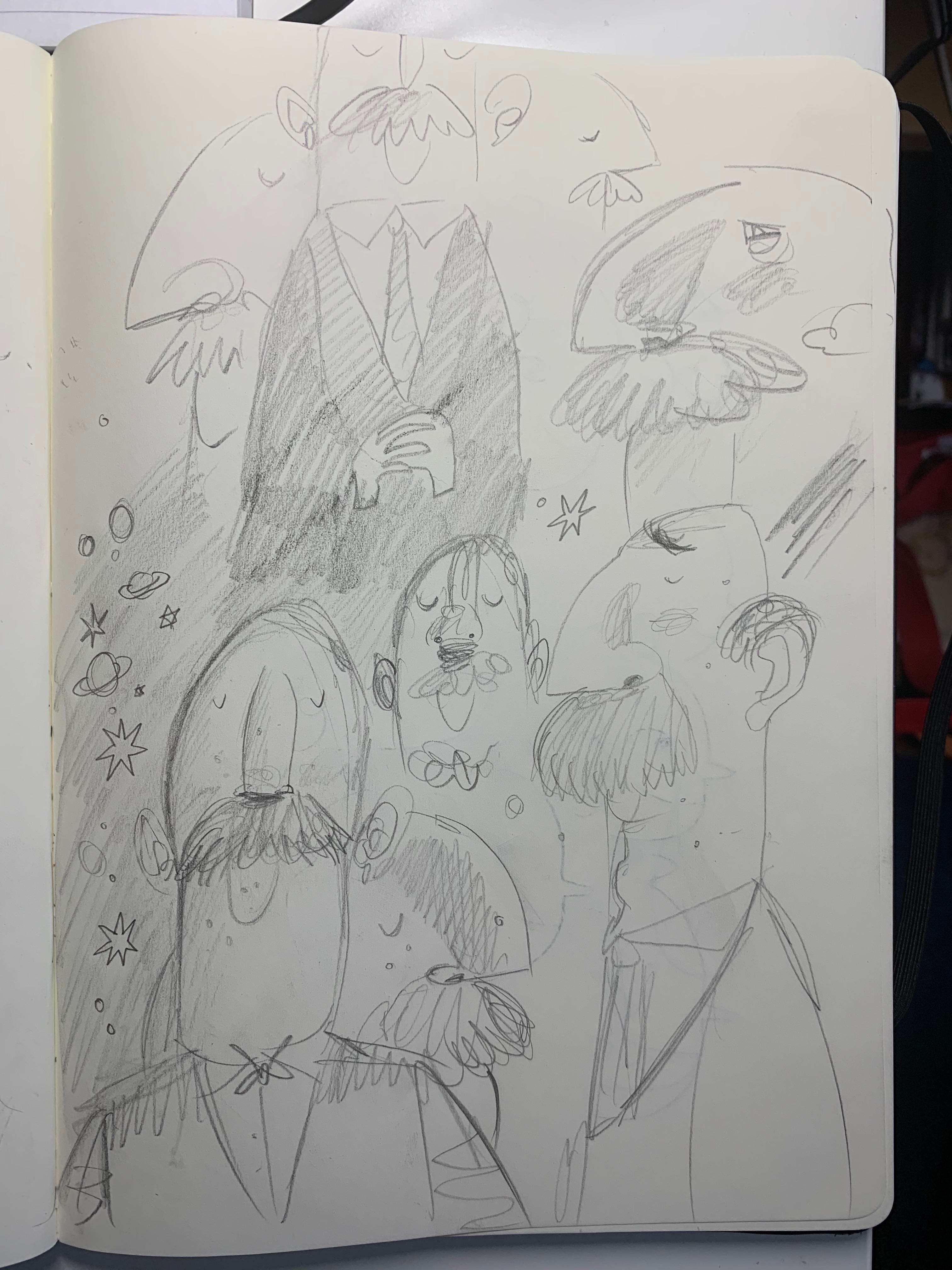
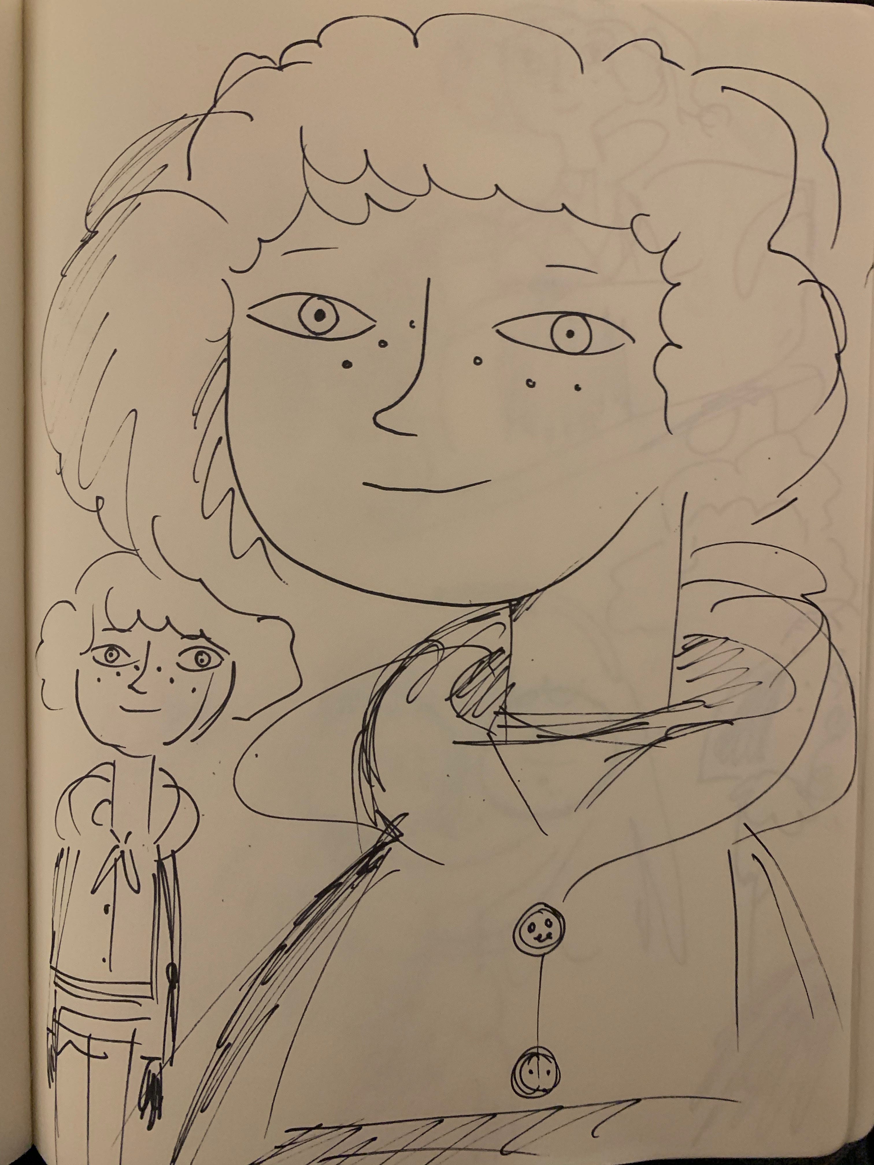
Again, I went back to my Sketchbook. I started to think about the sub-characters. Who would Santa have in his life at this point? How would he be able to get hold of so many toys? Why did he decide to dedicate his life to delivering all of those toys to children every single year?
The idea of Santa’s uncles being toymakers and owning the Claus Brothers Toyshop quickly developed and, through more scruffy sketching, I started to slowly chisel the narrative out.

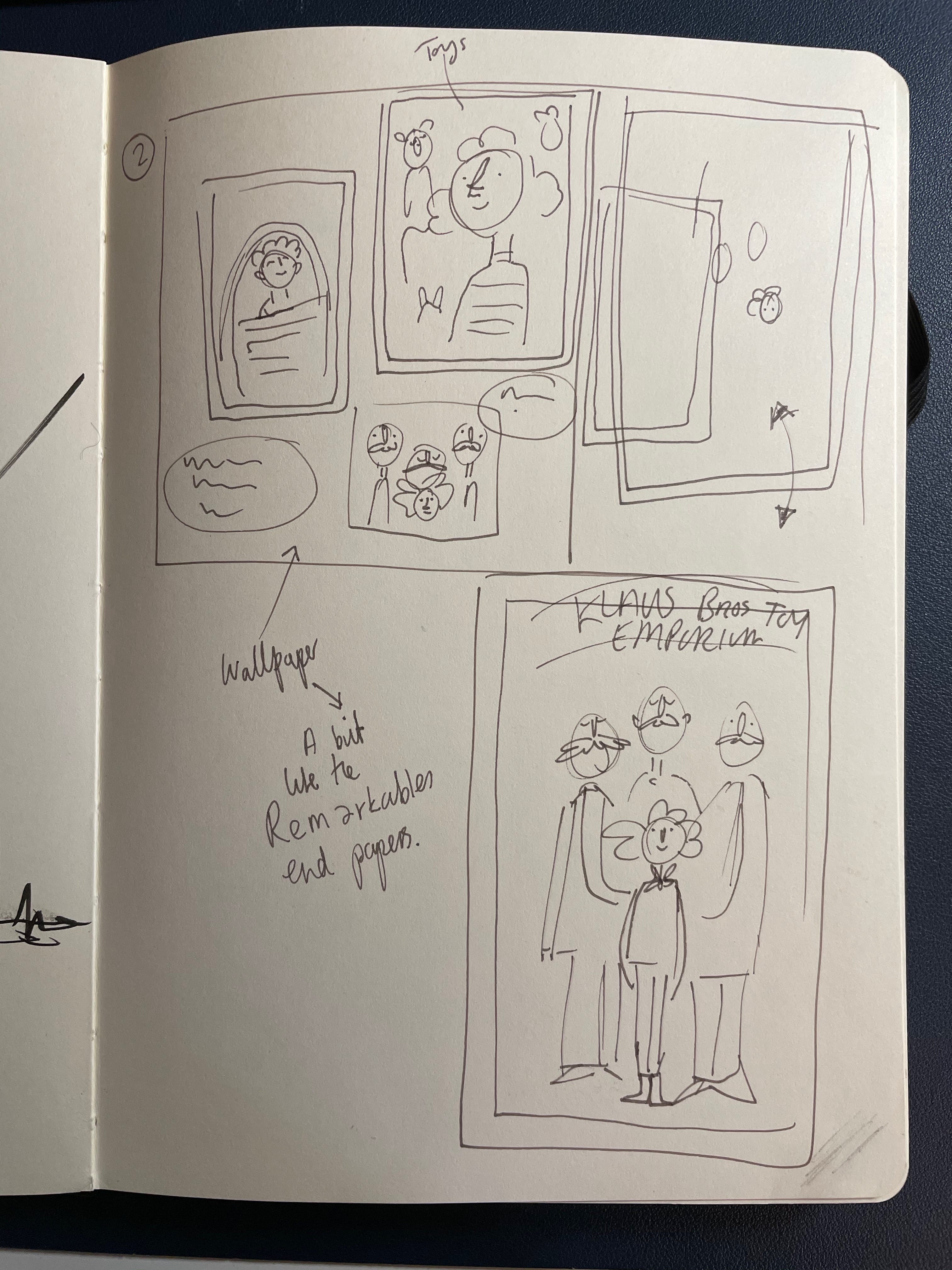


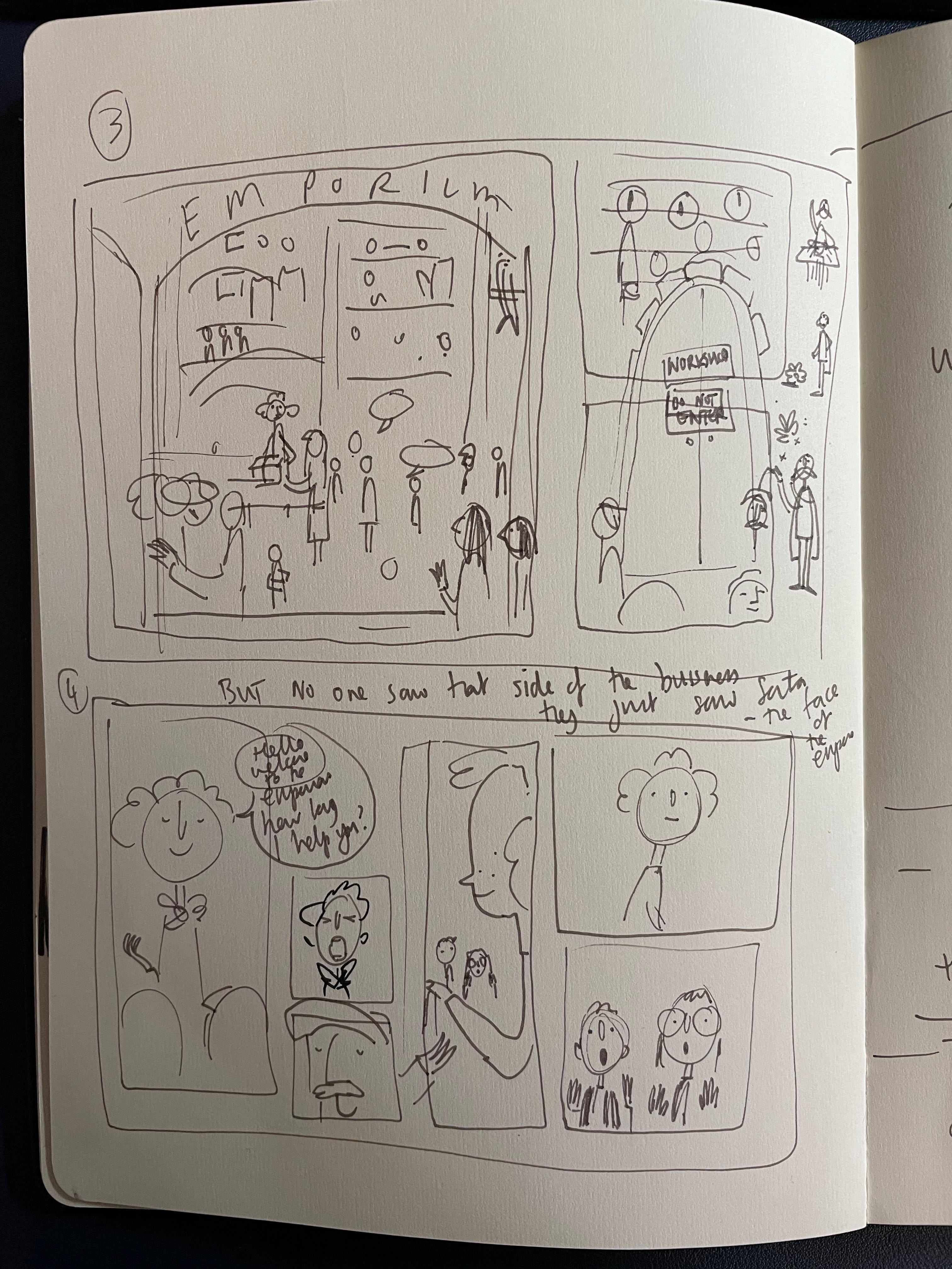
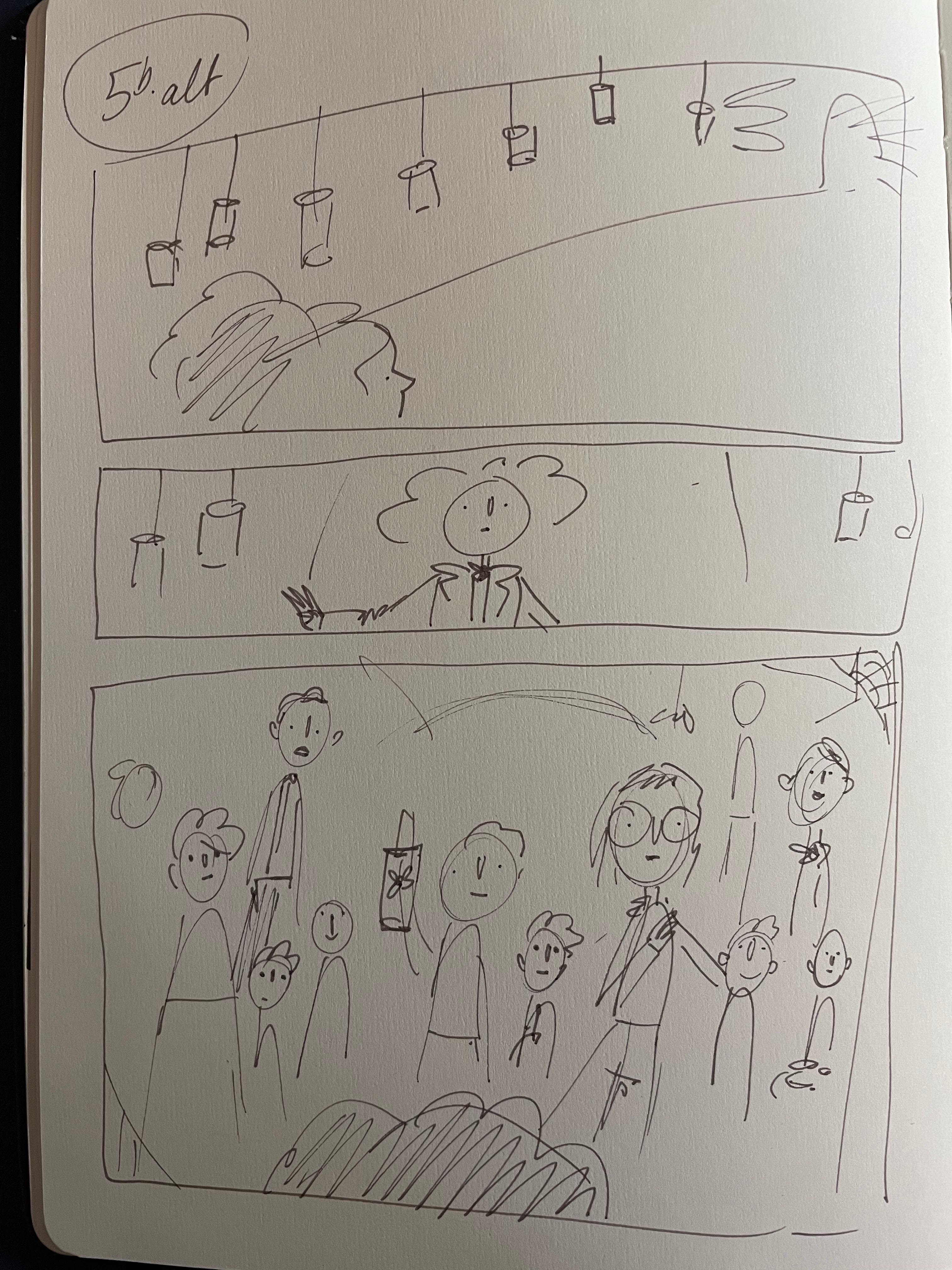
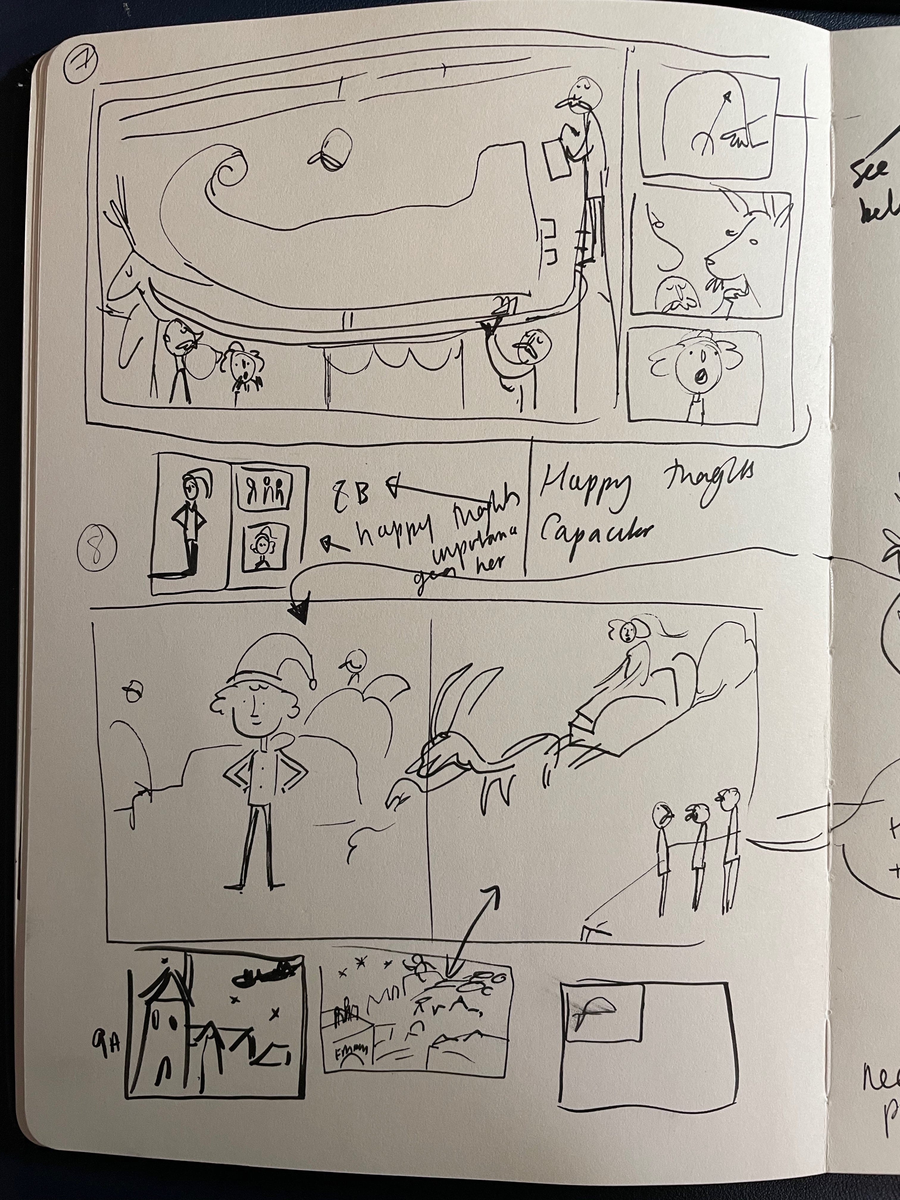
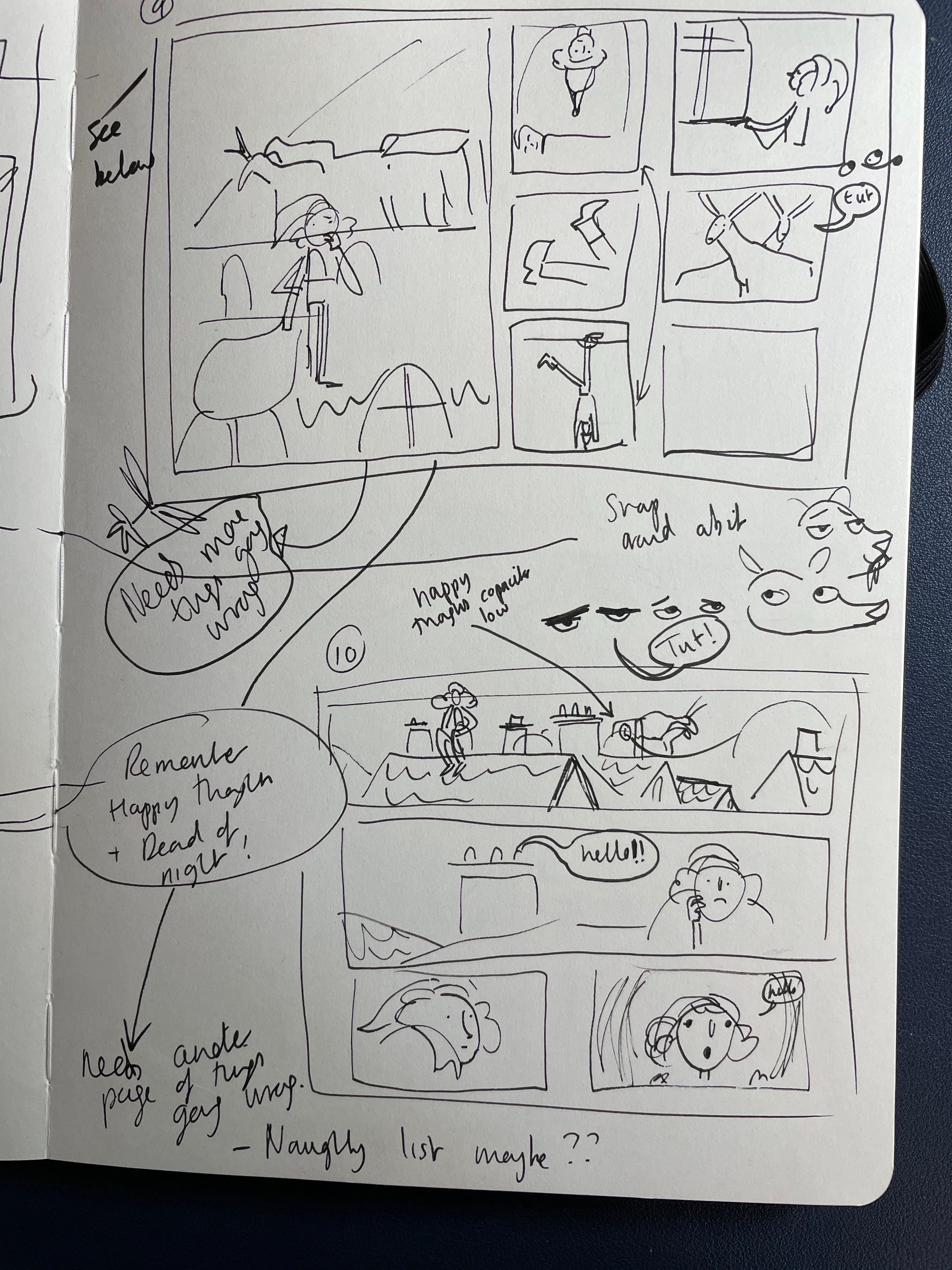
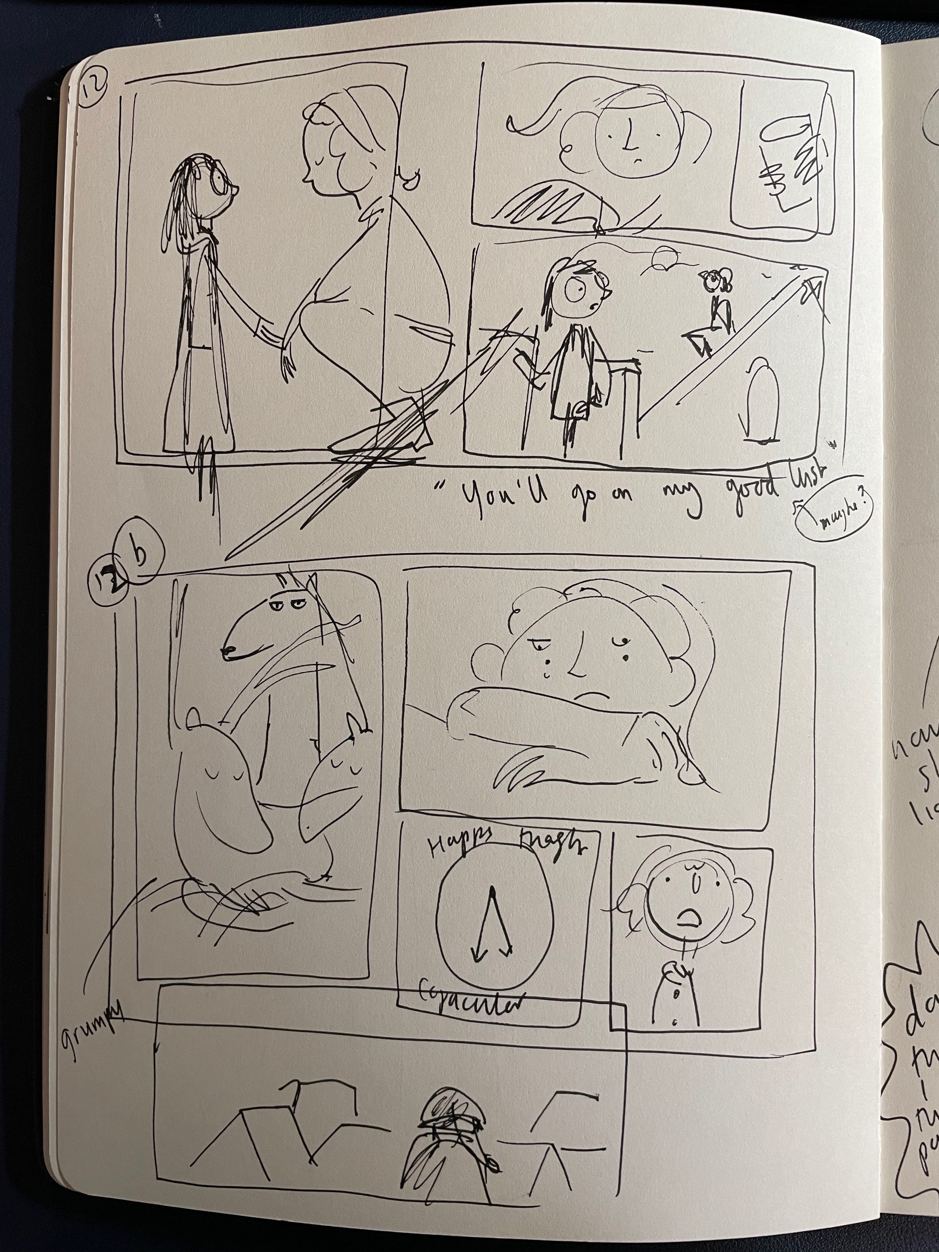
Thumbnails
Once I had the basic outline of the story in my head and in note form, I started to piece the pages together through-once again- very, very scruffy ‘thumbnail’ sketches.
Again, this stage is really exciting as the story really starts to form and some big decisions about structure, plotting and pacing start to take place. The thumbnails give me a good idea of how the story could flow and what information to include in each spread. Despite the fact that so much of it will still change in time, this step is the first true visualised version of the whole book. It’s an opportunity to see it on page, not just in my head.
Here are a few of the thumbnails. If you have the finished book you might be able to see the pages that these little doodles eventually became.
So, as we have deciphered the key word for all of these stages seems to be ‘scruffy’.
For me being very scruffy and quick and loose with my drawing during this stage helps me bring the ideas out. Theres an urgency and a freedom to it where there are no creative barriers. At this stage everything is scribbled down with no inhibitions. No one is going to be looking at the quality of the drawings, their sole purpose is to be the first building block of a bigger-hopefully slightly tidier- project.
Which brings me on to the subject of Part 2’s post, which will look at the first, official ‘Rough Draft’ of the book and the all important cover sketches. This stage is were other people- including my editor and art director at Frances Lincoln- will actually need to see what I am doing and offer feedback on the sketches that I do. So the pressure builds a bit here.
Gulp. What a cliffhanger :)
Keep an eye out for Part 2 coming in a few days.
Thanks for reading all x